# 单列布局
# 水平居中
水平居中的页面布局中最为常见的一种布局形式,多出现于标题,以及内容区域的组织形式,下面介绍四种实现水平居中的方法(注:下面各个实例中实现的是child元素的对齐操作,child元素的父容器是parent元素)
使用 inline-block 和 text-align 实现
.parent {
    text-align: center;
}
.child {
    display: inline-block;
}
优点:兼容性好; 不足:需要同时设置子元素和父元素
使用
margin:0 auto来实现.child { width: 200px; margin: 0 auto; }优点:兼容性好 缺点: 需要指定宽度
使用 table 实现
.child {
    display: table;
    margin: 0 auto;
}
优点:只需要对自身进行设置 不足:IE6,7 需要调整结构
使用绝对定位实现
.parent {
    position: relative;
}
/* 或者实用 margin-left 的负值为盒子宽度的一半也可以实现,不过这样就必须知道盒子的宽度,但兼容性好 */
.child {
    position: absolute;
    left: 50%;
    transform: translate(-50%);
}
不足:兼容性差,IE9 及以上可用
使用 flex 布局实现
/* 第一种方法 */
.parent {
    display:flex;
    justify-content: center;
}

/* 第二种方法 */
.parent {
    display: flex;
}
.child {
    margin:0 auto;
}
缺点:兼容性差,如果进行大面积的布局可能会影响效率
# 垂直居中
vertical-align
我们都知道,每个人都有不同的嗜好,有的人喜欢吃甜食,有的人喜欢吃辣的东西,有的人不喜欢吃芹菜,有的人不喜欢吃羊肉等等。CSS 中的有些元素也是这样,他们有的只对牛奶感兴趣,有的只喜欢吃坚果和果冻,而讨厌牛奶。而 vertical-align 呢,是个比较挑食的家伙,它只喜欢吃果冻,从小吃果冻长大,没有了果冻,它就会闹脾气,对你不理不睬。我称之为“果冻依赖型元素”,又称之为“inline-block 依赖型元素”,也就是说,只有一个元素属于 inline 或是 inline-block(table-cell 也可以理解为 inline-block 水平)水平,其身上的 vertical-align 属性才会起作用(参考 (opens new window))
在使用 vertical-align 的时候,由于对齐的基线是用行高的基线作为标记,故需要设置 line-height 或设置
display: table-cell;/*第一种方法*/ .parent { display: table-cell; vertical-align: middle; height:20px; } /*第二种方法*/ .parent { display: inline-block; vertical-align: middle; line-height: 20px; }利用绝对定位
.parent {
    position: relative;
}
.child {
    positon: absolute;
    top: 50%;
    transform: translate(0,-50%);
}
利用 flex 实现
.parent {
    display: flex;
    align-items: center;
}
# 水平垂直全部居中
利用 vertical-align, text-align, inline-block 实现
.parent {
    display: table-cell;
    vertical-align: middle;
    text-align: center;
}
.child {
    display: inline-block;
}
利用绝对定位实现
.parent {
    position: relative;
}
.child {
    position: absolute;
    top: 50%;
    left: 50%;
    transform: translate(-50%,-50%);
}
利用 flex 实现
.parent {
    display: flex;
    justify-content: center;
    align-items: center;
}
# 多列布局
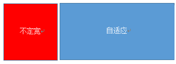
# 左列定宽,右列自适应
该布局方式非常常见,适用于定宽的一侧常为导航,自适应的一侧为内容的布局
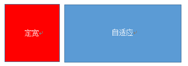
利用 float+margin 实现
.left {
    float: left;
    width: 100px;
}
.right {
    margin-left: 100px;
}
注:IE6 会有 3px 的 bug
利用 float+margin(fix) 实现
<div class="parent">
    <div class="left"></div>
    <div class="right-fix">
        <div class="right"></div>
    </div>
</div>
.left { width: 100px; float: left; } .right-fix { width: 100%; margin-left: -100px; float: right; } .right { margin-left: 100px; }利用 float+overflow 实现
.left {
    width: 100px;
    float:left;
}
.right {
    overflow: hidden;
}
overflow: hidden触发 bfc 模式,浮动无法影响,隔离其他元素,IE6 不支持(关于BFC (opens new window))如果我们需要将两列设置为等高,可以用下述方法将“背景”设置为等高,其实并不是内容的等高
.left {
    width: 100px;
    float: left;
}
.right {
    height: 500px;
    overflow: hidden;
}
.parent {
    overflow: hidden;
}
.left, .right {
    padding-bottom: 9999px;
    margin-bottom: -9999px;
}
利用 table 实现
.parent {
    display: table;
    table-layout: fixed;
    width: 100%;
}
.left {
    width: 100px;
}
.right, .left {
    display: table-cell;
}
利用 flex 实现
.parent {
    display: flex;
}
.left {
    width: 100px;
}
.right {
    flex: 1;
}
利用右侧容器的 flex:1,均分了剩余的宽度,也实现了同样的效果。而 align-items 默认值为 stretch,故二者高度相等
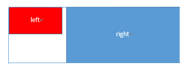
# 右列定宽,左列自适应
使用 float+margin 实现
.parent {
    background: red;
    height: 100px;
    margin: 0 auto;
}
.left {
    background: green;
    margin-right: -100px;
    width: 100%;
    float:left;
}
.right {
    float: right;
    width: 100px;
    background: blue;
}
使用 table 实现
.parent {
    display: table;
    table-layout: fixed;
    width: 100%;
}
.left {
    display: table-cell;
}
.right {
    width: 100px;
    display: table-cell;
}
使用 flex 实现
.parent {
    display: flex;
}
.left {
    flex: 1;
}
.right {
    width: 100px;
}
# 两列定宽,一列自适应
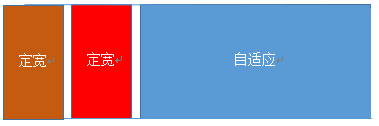
基本 html 结构为父容器为 parent,自容器为 left, center, right. 其中,left, center 定宽,right 自适应
利用 float+margin 实现
.left, .center {
    float: left;
    width: 200px;
}
.right {
    margin-left: 400px;
}
利用 float+overflow 实现
.left, .center {
    float: left;
    width: 200px;
}
.right {
    overflow: hidden;
}
利用 table 实现
.parent {
    display: table;
    table-layout: fixed;
    width: 100%;
}
.left, .center, .right {
    display: table-cell;
}
.left, .center {
    width: 200px;
}
利用 flex 实现
.parent {
    display: flex;
}
.left, .center {
    width: 100px;
}
.right {
    flex: 1;
}
# 两侧定宽,中栏自适应
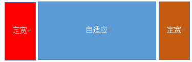
利用 float+margin 实现
.left {
    float: left;
    width: 100px;
}
.center {
    float: left;
    width: 100%;
    width: calc(100% - 200px);
}
.right {
    float: right;
    width: 100px;
}
利用 table 实现
.parent {
    width: 100%;
    display: table;
    table-layout: fixed;
}
.left, .center, .right {
    display: table-cell;
}
.left {
    width: 100px;
}
.right {
    width: 100px;
}
利用 flex 实现
.parent {
    display: flex;
}
.left {
    width: 100px;
}
.center {
    flex: 1;
}
.right {
    width: 100px;
}
# 一列不定宽,一列自适应
利用 float+overflow 实现
.left {
    float: left;
}
.right {
    overflow: hidden;
}
利用 table 实现
.parent {
    display: table;
    table-layout: fixed;
    width: 100%;
}
.left {
    width: 0.1%;
}
.left, .right {
    display: table-cell;
}
利用 flex 实现
.parent {
    display: flex;
}
.right {
    flex: 1;
}
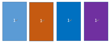
# 多列等分布局
多列等分布局常出现在内容中,多数为功能的,同阶级内容的并排显示等。
<!-- Html 结构如下 -->
<div class="parent">
    <div class="column">1</div>
    <div class="column">1</div>
    <div class="column">1</div>
    <div class="column">1</div>
</div>
使用 float 实现
.parent {
    /* 假设列之间的间距为20px */
    margin-left: -20px
}
.column {
    float: left;
    width: 25%;
    padding-left: 20px;
    box-sizing: border-box;
}
利用 table 实现
.parent-fix {
    margin-left: -20px;
}
.parent {
    display: table;
    table-layout: fixed;
    width: 100%;
}
.column {
    display: table-cell;
    padding-left: 20px;
}
利用 flex 实现
.parent {
    display: flex;
}
.column {
    flex: 1;
}
.column + .column {
    margin-left: 20px;
}
# 九宫格布局
使用 table 实现
<div class="parent">
    <div class="row"><div class="item"></div><div class="item"></div><div class="item"></div></div>
    <div class="row"><div class="item"></div><div class="item"></div><div class="item"></div></div>
    <div class="row"><div class="item"></div><div class="item"></div><div class="item"></div></div>
</div>
.parent { display: table; table-layout: fixed; width: 100%; } .row { display: table-row; } .item { display: table-cell; width: 33.3%; height: 200px; }利用 flex 实现
<div class="parent">
    <div class="row"><div class="item"></div><div class="item"></div><div class="item"></div></div>
    <div class="row"><div class="item"></div><div class="item"></div><div class="item"></div></div>
    <div class="row"><div class="item"></div><div class="item"></div><div class="item"></div></div>
</div>
.parent { display: flex; flex-direction: column; } .row { height: 100px; display: flex; } .item { width: 100px; background: red; }
# 全屏布局
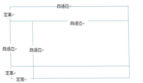
利用绝对定位实现
<div class="parent">
    <div class="top">top</div>
    <div class="left">left</div>
    <div class="right">right</div>
    <div class="bottom">bottom</div>
</div>
html, body, parent { height: 100%; overflow: hidden; } .top { position: absolute; top: 0; left: 0; right: 0; height: 100px; } .left { position: absolute; top: 100px; left: 0; bottom: 50px; width: 200px; } .right { position: absolute; overflow: auto; left: 200px; right: 0; top: 100px; bottom: 50px; } .bottom { position: absolute; left: 0; right: 0; bottom: 0; height: 50px; }利用 flex 实现
<div class="parent">
    <div class="top">top</div>
    <div class="middle">
    <div class="left">left</div>
    <div class="right">right</div>
    </div>
    <div class="bottom">bottom</div>
</div>
.parent { display: flex; flex-direction: column; } .top { height: 100px; } .bottom { height: 50px; } .middle { flex: 1; display: flex; } .left { width: 200px; } .right { flex: 1; overflow: auto; }
# 响应式布局
meta 标签的使用
设置布局宽度等于设备宽度,布局 viewport 等于度量 viewport
<meta name="viewport" content="width=device-width, initial-scale=1">媒体查询
<!-- 语法 -->
<style>
    @media screen and (max-width:960px) {
        ....
    }
</style>

<link rel="stylesheet" media="screen and (max-width:960px)" href='xxx.css' />
本文转载自:https://segmentfault.com/a/1190000003931851 (opens new window)